Water Project
Infographic Design
Infographics pose a really interesting design challenge. Their purpose is not just to convey information, but to do it in a beautiful and engaging way. To my mind, a sucessful infographic draws the viewer in on a visual level, and engages them long enough to let the message settle in and make an impact.
The Brief
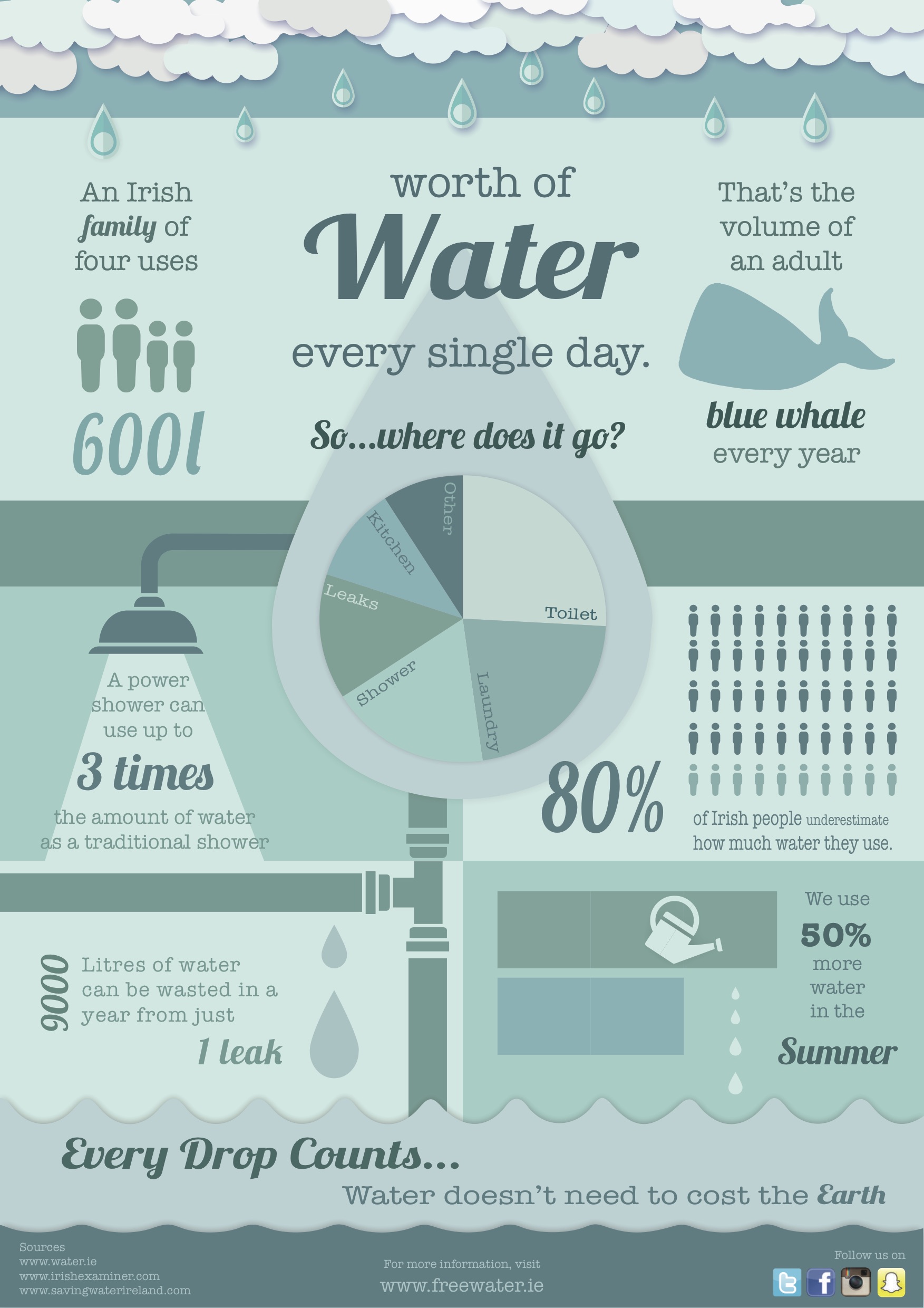
The brief for this infographic was a topical one at the time. Irish water had just been established, and didn’t become instantly popular with the Irish public. They had a disasterous media campaign, but could it have benefitted from better handling of information and statistics? Our challenge was to make an infographic emphasising the importance of water conservation. I decided to design one based on how the average family uses their water, and where they can save it.
Research is at the heart of a good infographic. I looked at the Irish Water website, and articles from Meath County Council, Irish Examiner, and Saving Water Ireland. I tried to convert the data into memorable ways. It’s hard to visualise what 600 litres of water is, but when it is compared to the size of a blue whale it becomes more concrete.
For inspiration on making beautiful infographics, I looked at Lemonly, a design company based in South Dakota. They produce infographics on everything from the landmarks of Cairo, to what makes a great tweet.
The Infographic