The Butcher Project
Logo Design
The Brief
For this project, the brief was to create a logo for a fictional butcher shop called ‘The Cut-Throat Butchers’. Unlike the bike shop project, we were given freedom on how the company wanted to brand itself. This meant I was free to explore different styles. I did one set of logos with a more fun, quirky kind of style, and another more refined option.
The Process
I began the design process as I always do, by brainstorming the theme or brief. I wrote down everything I could think of that related to butcher shops in any way, and started making thumbnail sketches. At this point, I was trying to find pleasing shapes that might fit together in interesting ways. Generally speaking, when designing a logo I reject the first few ideas that I come up with, on the basis that if they come to mind straight away, they are probably clichès.
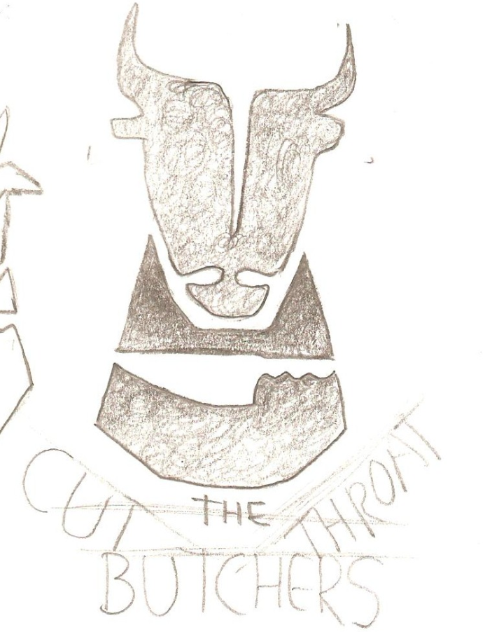
When I had some thumbnails that I thought had potential, I scanned them, and brought them into Illustrator. I used them as templates, and drew over them with the pen tool. When I have a lot of vector shapes in Illustrator it’s easier to play around with scale, colour and overlapping shapes until I find something that works.
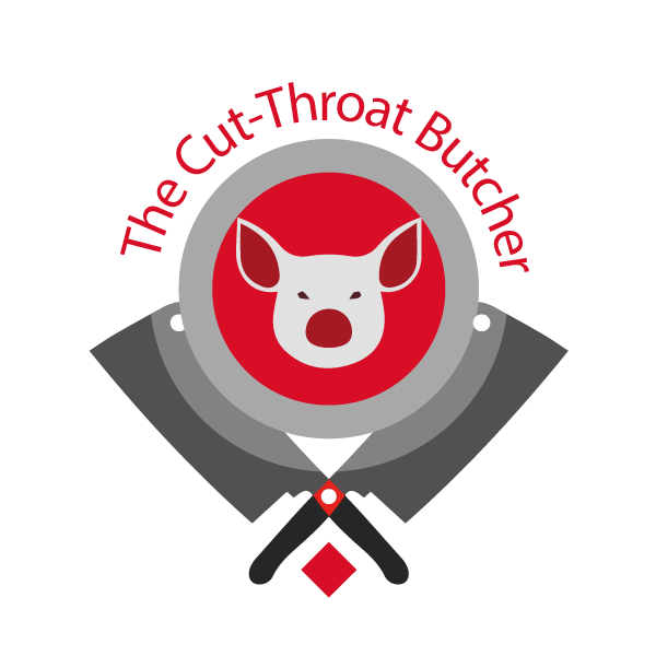
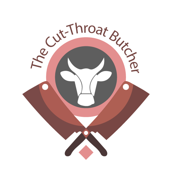
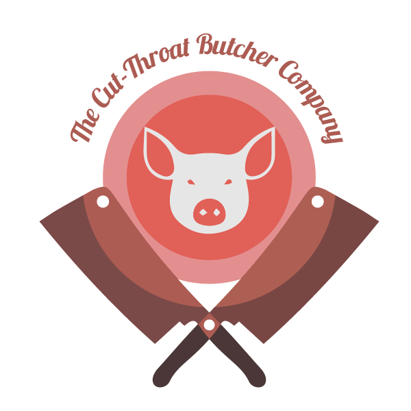 Exploring variations in colour, font and shape.
The second style I explored was a more sophisticated, refined option. I shortened the name of the company to the C.T. Boucherie, and used more simple shapes. I liked the idea of using negative space, and used it to bring the motifs of the animal and knife together. I tried out this design in both red and grey. The grey one would be my preference for the final logo, it has a more subtle and sophisticated feel.
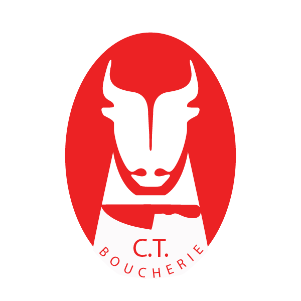
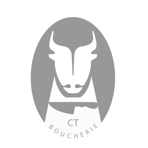 Comparing colour vs greyscale in the final logo design.