THE STUDDED CHAIN
Research - Branding - Web Design
This project was for a Visual Design module of my masters. The challenge was to create a brand identity for a fictional bicycle shop, The Studded Chain.
“The Studded Chain is a soon-to-launch vintage bicycle store, selling original vintage bicycles and bike accessories. An integral part of the business is also to repair old bicycles, giving them a new lease of life. They require an identity that is fresh and current, and sets them aside from regular bike shops. Consider how the brand might use its online presence to achieve its core aims and objectives.”
Based on the brief I created a brand identity for The Studded Chain, including logo, business card mock-up, an iPhone icon, and a client presentation presenting my research and final design solutions. From these style guide-lines, I created designs for a responsive mobile and desktop website. Finally, I created an interactive prototype in Axure, which can be seen here.
Research
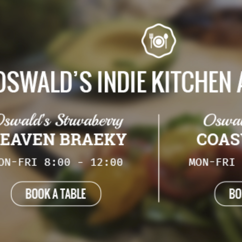
The first step in the process was research into the competition. I looked at the logos and brand identities of some existing bicycle shops, to get a feel for current trends. I tended to see bright, vivid colours, and an emphasis on simple circular shapes. Motifs such as chains and gears cropped up again and again.
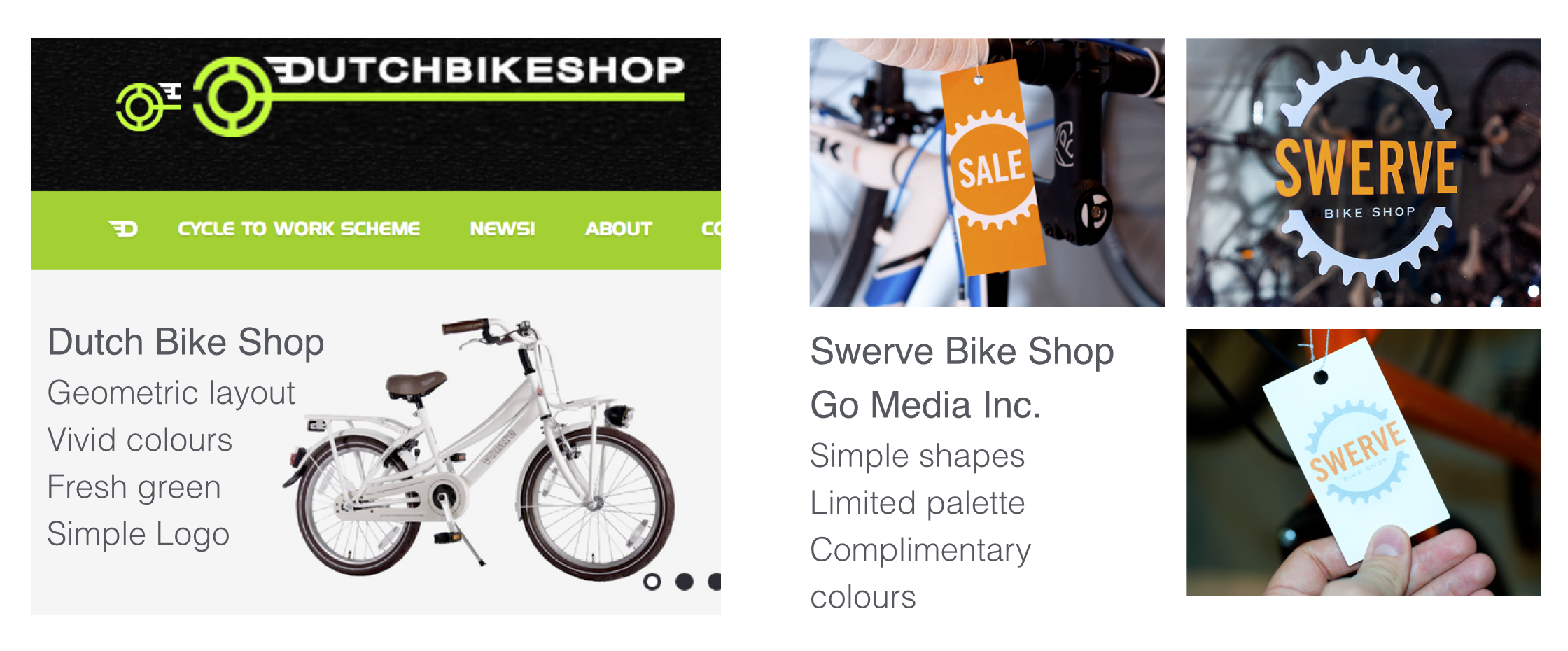 Competing brands' visual styles
In an effort to create an identity that was “fresh and current”, I also looked at current web design trends. I found an emphasis on high-quality, filtered photography with text overlays, grid layouts, flat bands of colour and pure CSS buttons.
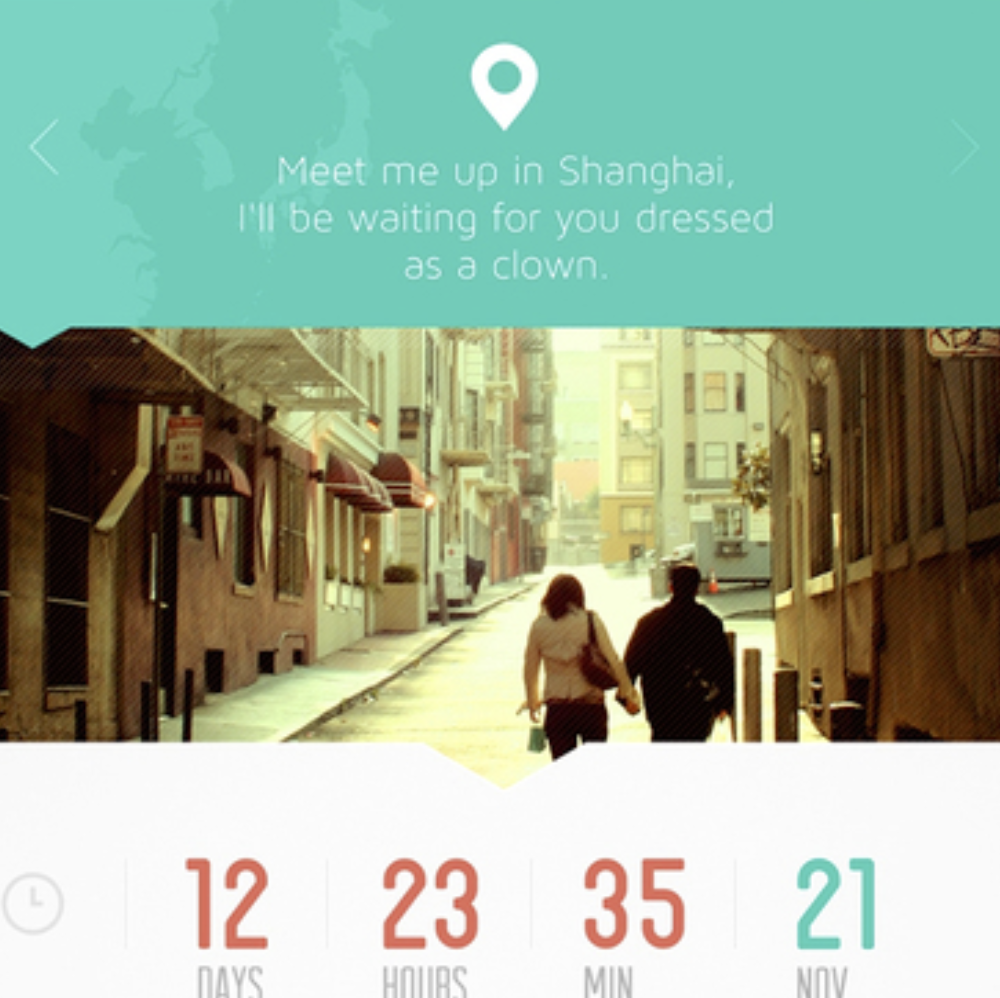
 Looking at current web trends
The unique selling point of The Studded Chain is its emphasis on vintage bicycles and so I could use more subtle colours to emphasise a more hip, independant feel, and set it aside from the larger chain stores.
Visual Design
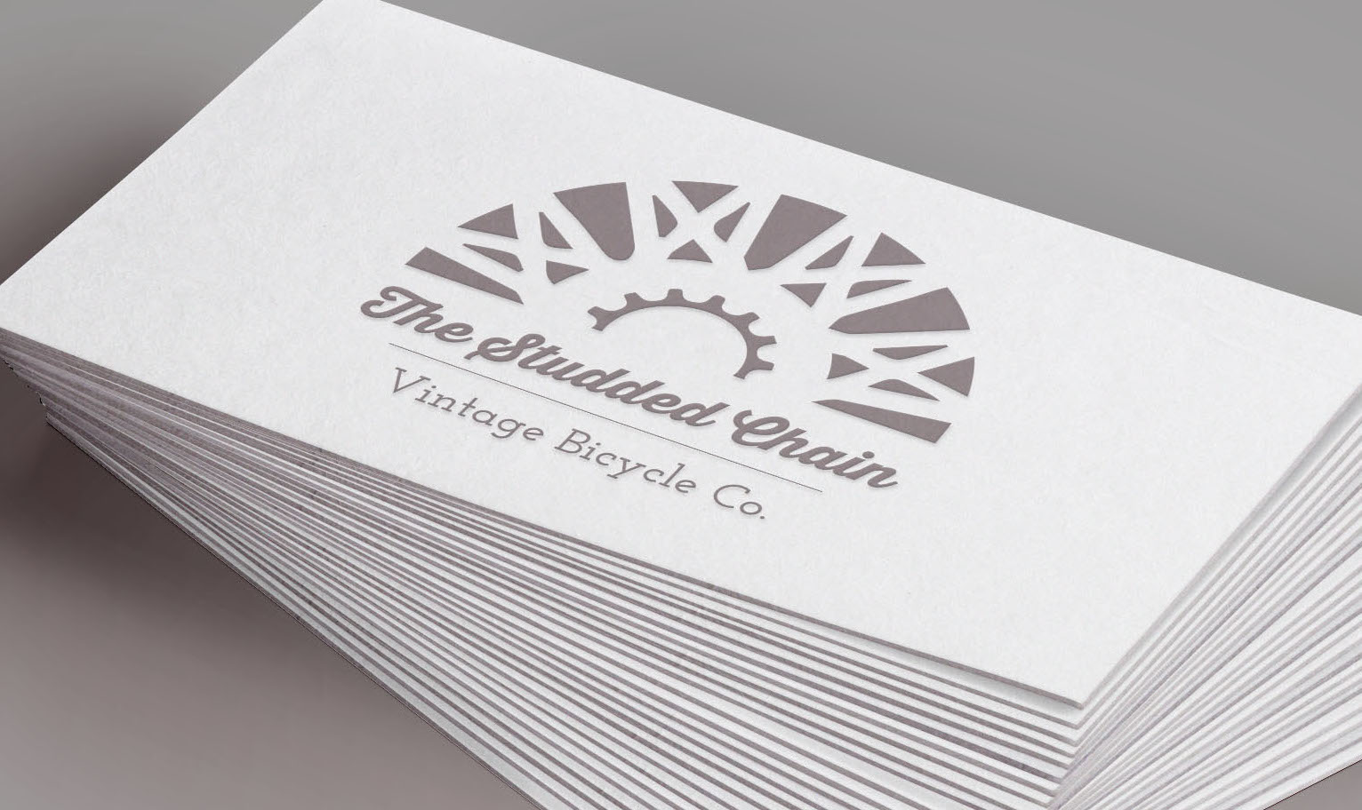
The first challenge I approached was creating the logo. It needed to embody the whole brand identity, so that I could use it as a starting point for other design decisions later.
I opted for a simple geometric semi-circle logo with soft colours. The wheel motif envokes the symbolism of new beginnings, fitting for a shop that gives new life to old bicycles. The bold cursive font was chosen to appear friendly, and the typewritten style font gives a more ‘old-time’ feel.


 Final logo designs and iPhone icon
From the logo design, I was able to create the style guidelines for the brand, in the form of a style tile. This would provide the design direction for the website and any other online or printed materials for the brand. It includes font and colour choices, and possible buttons, icons, headings and textures.
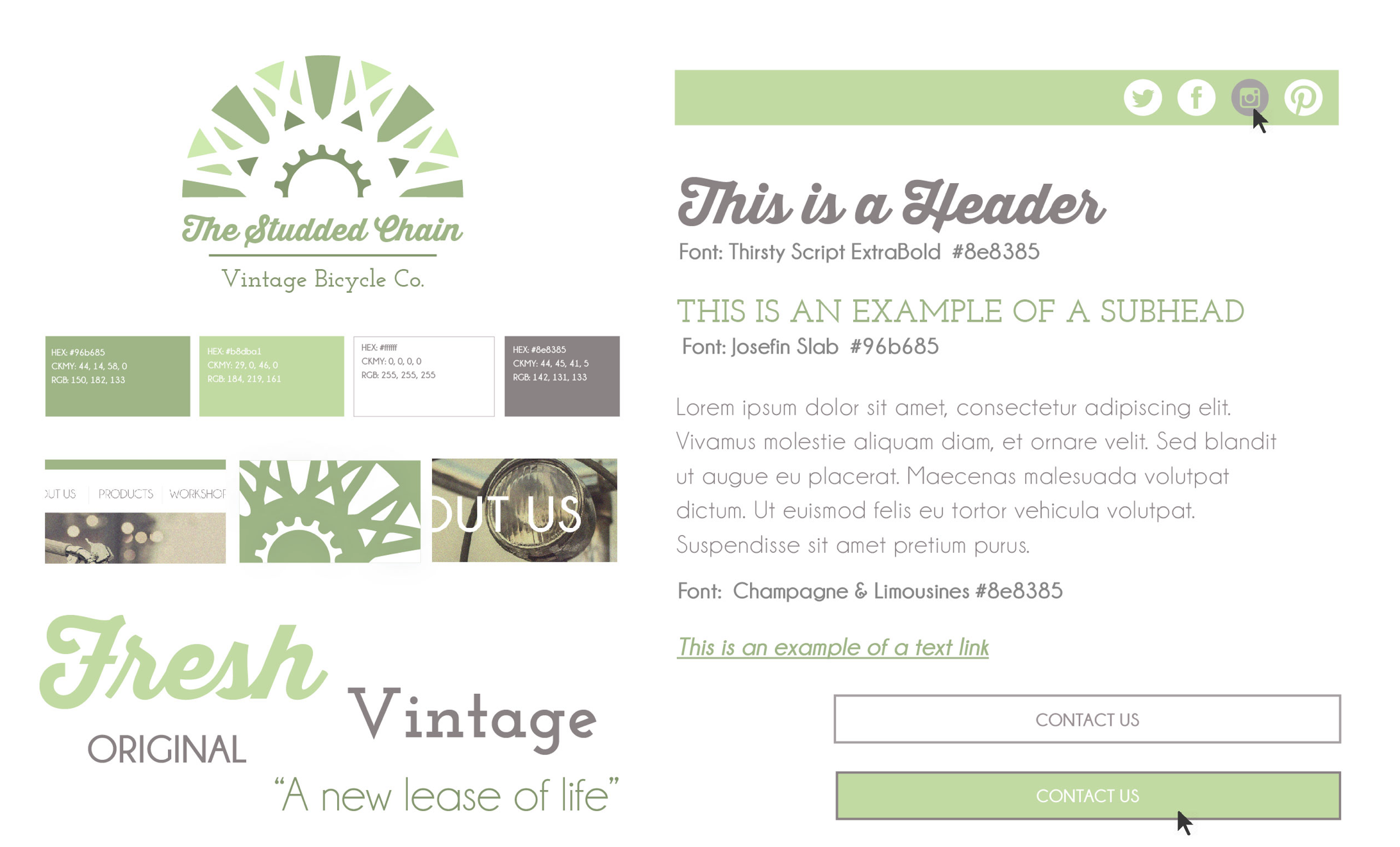 Style Tile
Website Design
The first step in designing the website was to analyse the basic componants needed in a bicycle shop website, and to create a diagram outlining the structure of the pages. At this point, I found it useful to think in a ‘mobile-first’ mindset, so that I could strip the design down to what is really needed.
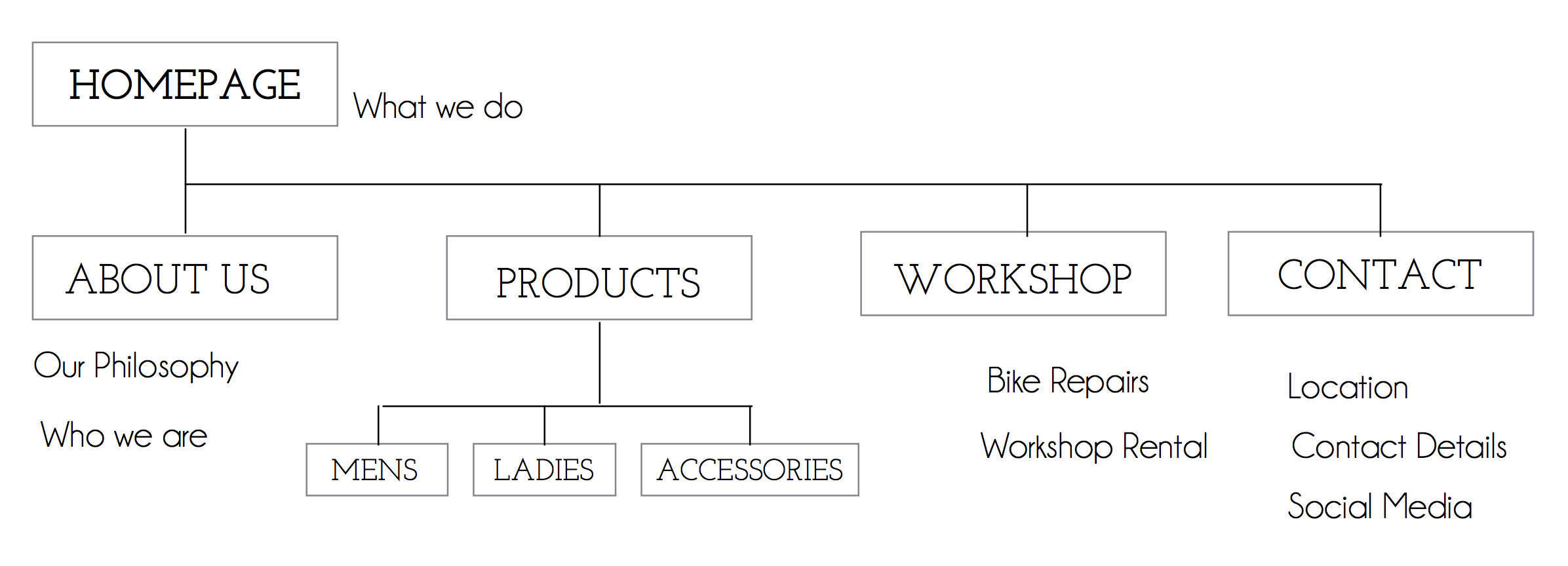 Website site map
With a plan in place for the contents of each page, I set to making wireframes for both mobile and desktop sites. I based my design around a responsive 12 column grid, so that the final design could be built for both mobile and desktop.
Desktop Mock-Ups
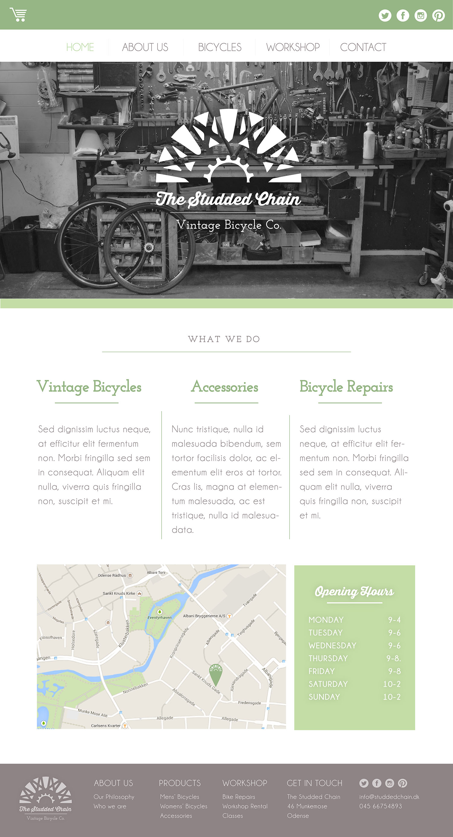
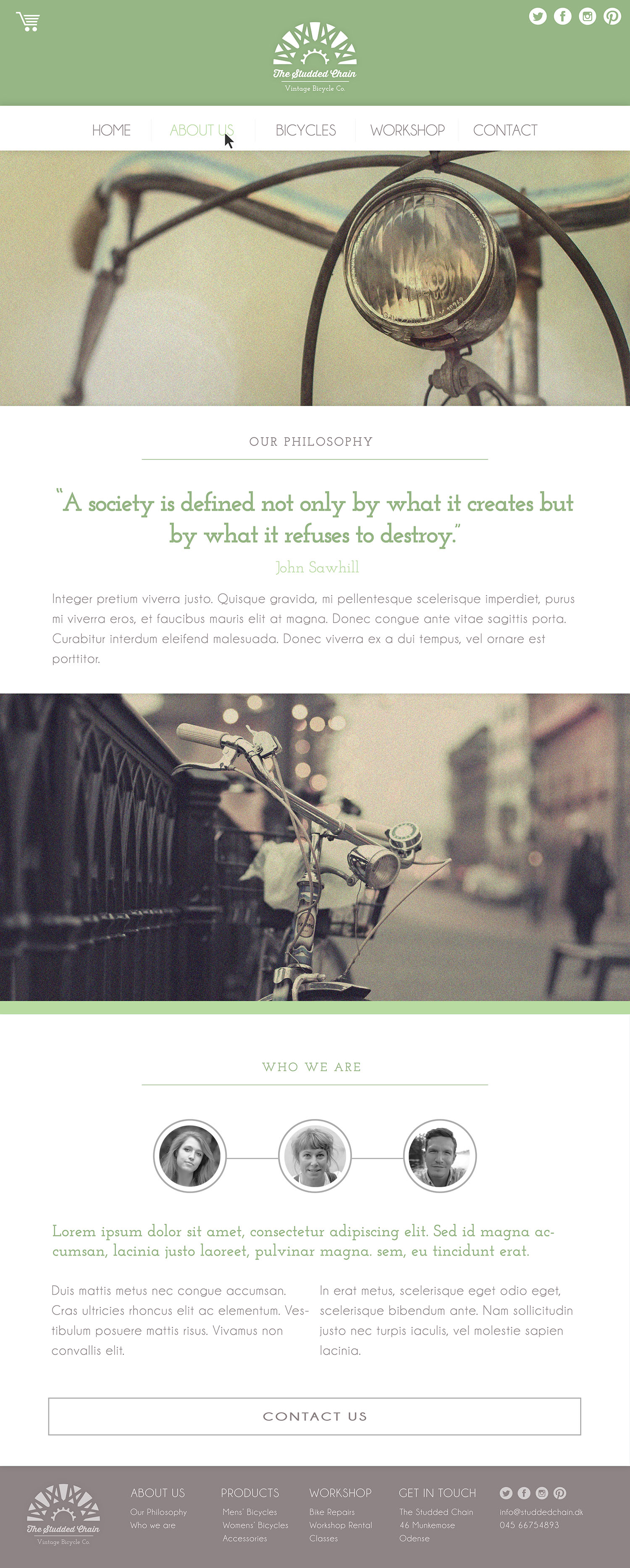
With wireframes done, the next step was to create high-fidelity mock-ups of the ‘Home’, ‘About’ and ‘Bicycles’ pages. I used Adobe Illustrator to create the mock-ups, and the photographs are ones that I found online, and edited in Photoshop. If the project was for a client, these would be replaced with original photographs.
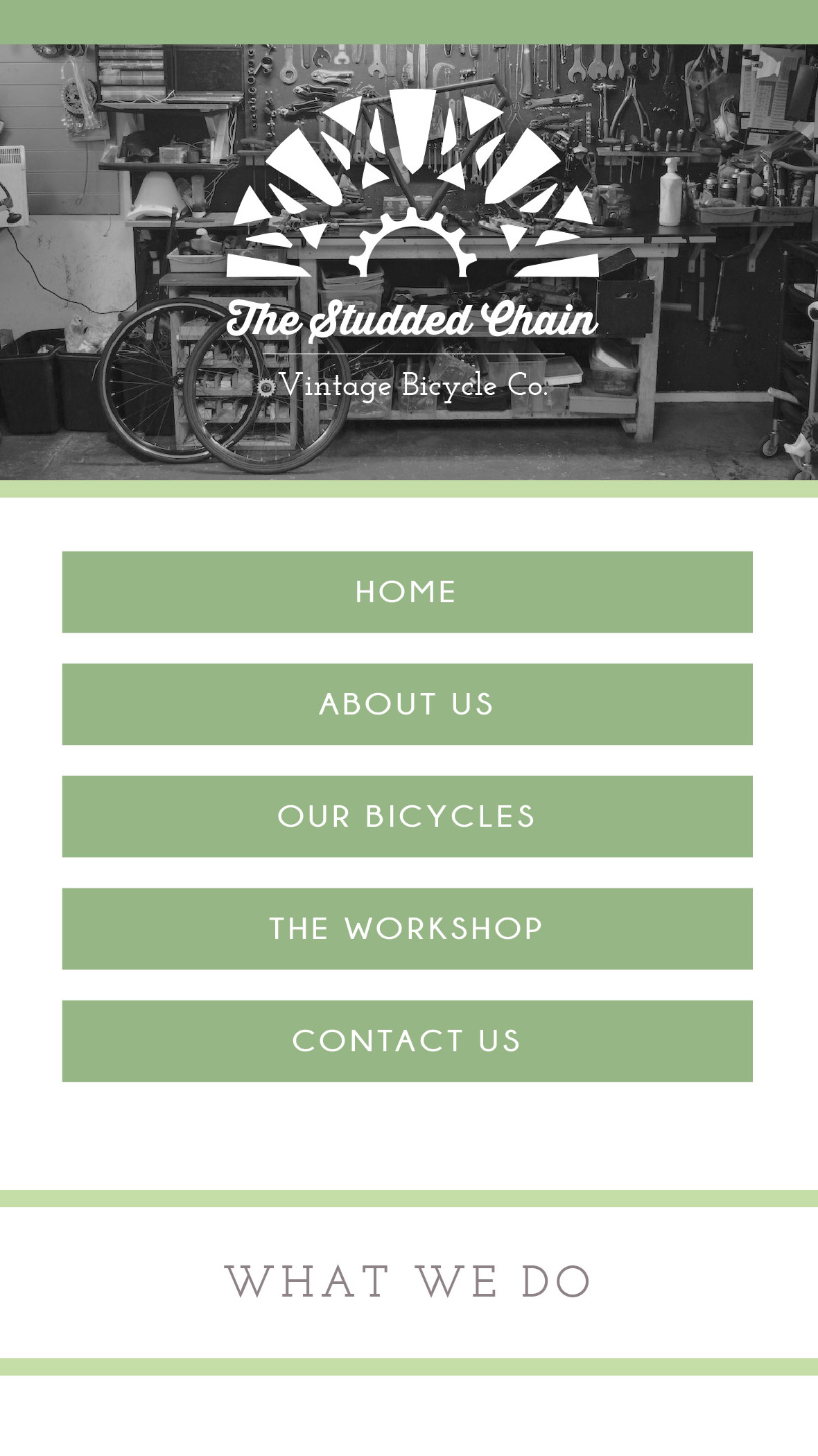
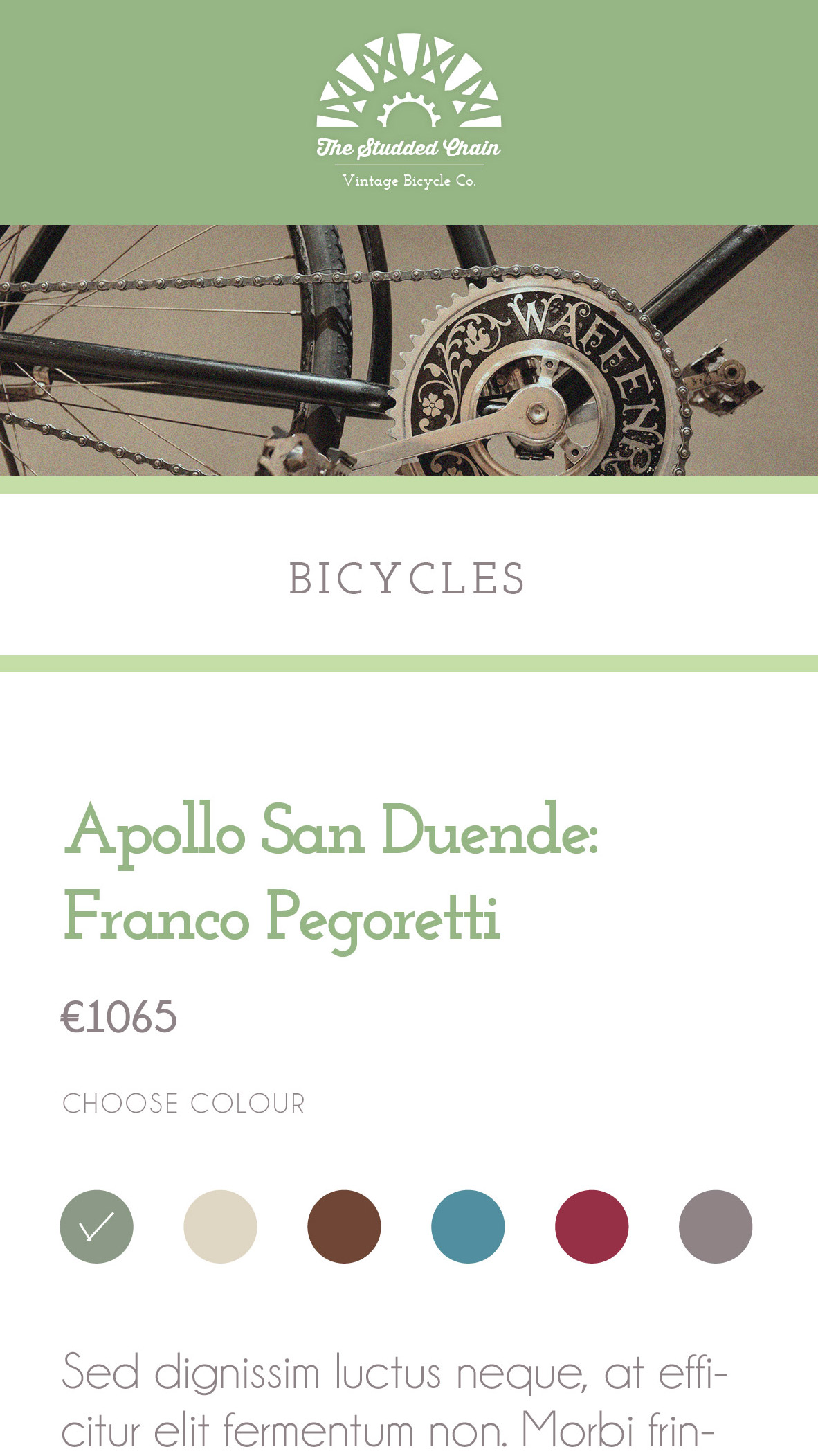
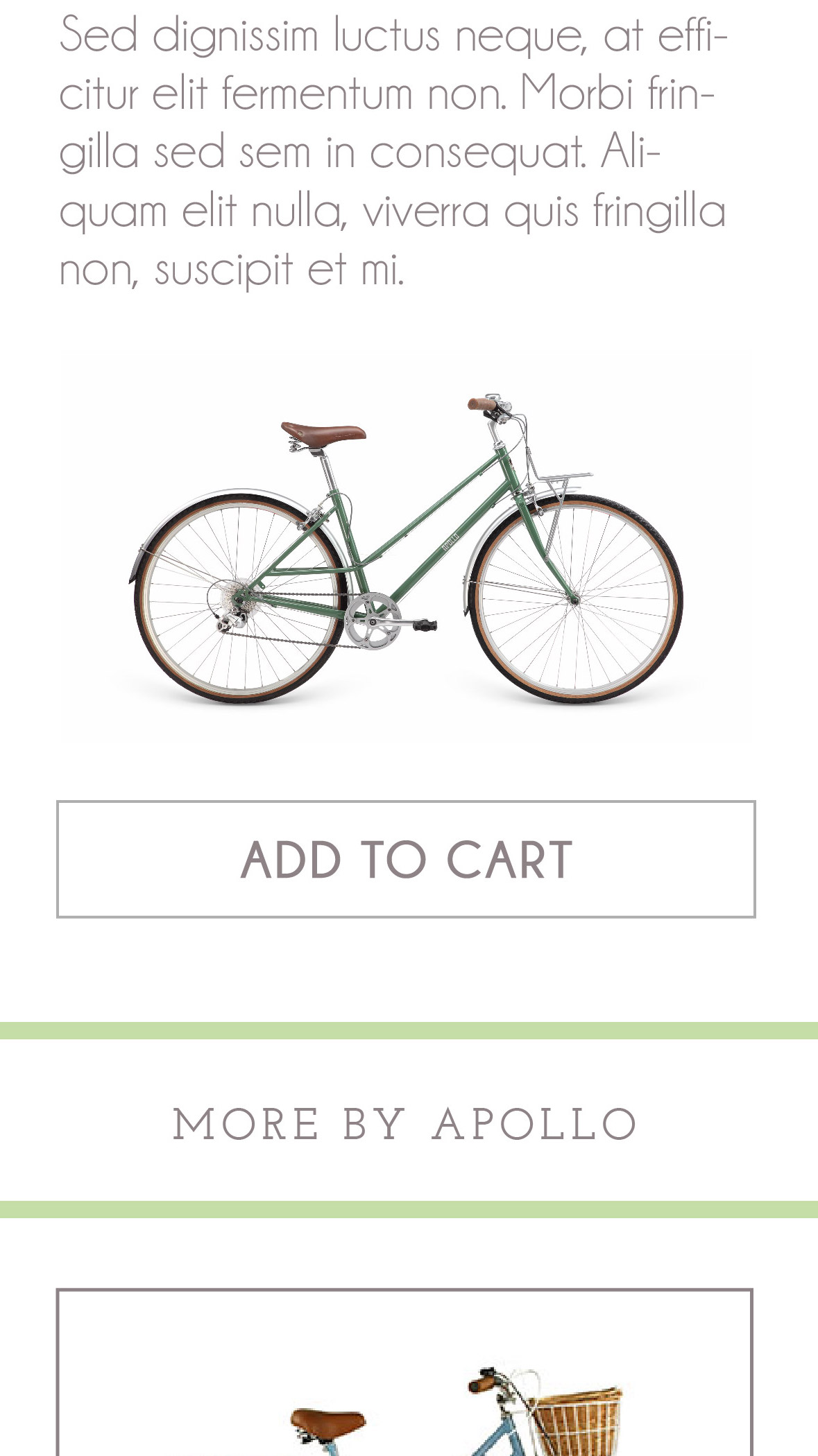
Mobile Mock-Ups
Content Analysis
From the high-fi mock-ups I created a content analysis document detailing the assets needed for every page, so that they can be easily saved down to the right sizes and put into the code. A clear naming convention is needed for files so that they can be easily recognised in the development stage.
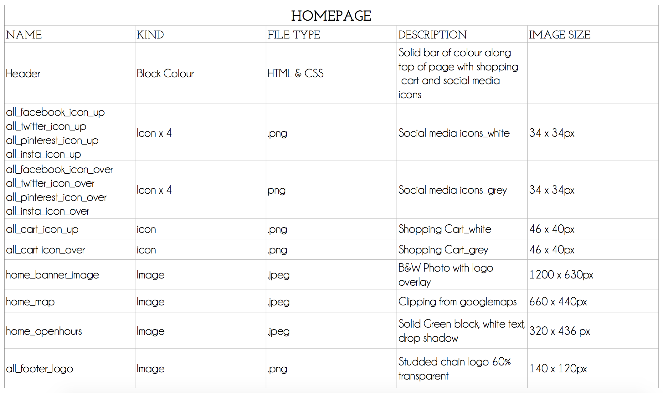 Content analysis document for home page
Interactive Prototype
Finally, I created an interactive prototype of the website using Axure. Explore it at http://s9yiui.axshare.com/#c=2.