Where's Paul?
UX App Design & Prototyping

‘Where’s Paul?’ is a UX project that I did as part of a module taught by John Wood. I designed an app to solve a specific problem for a fictional consultancy firm. They needed a way for employees to be able to keep track of each other during the working day, and wanted an app as a solution.
The first part of the project was to study the user interviews given to us, define the problem, brainstorm solutions, and design a first draft of wireframes. This part was done in teams, I worked alongside Matthew Cortland, Karl Power and Huan Zhang.
The second part was done on an individual basis. Using the initial concept, we had to test and refine it, design high-fidelity mock-ups using Sketch, and finally make an interactive prototype using InVision.
Scroll all the way down to play with the interactive prototype!
The Challenge
“Widget Consulting is an IT consulting company based in the city centre. They have a small support team of three people covering finance and HR, a sales team and twenty-five IT Consultants. These consultants and the sales team spend a considerable amount of time on site with their clients. They are also permitted to work from home if they agree this in advance with their project manager.
The problem is, they are all very bad indeed at updating their calendars and at letting the Support Team members know where they are. This results in the support team having to email and text and phone most people who are not in the office to find out where they are. This is important because the company has a legal obligation to know where all employees are during working hours.
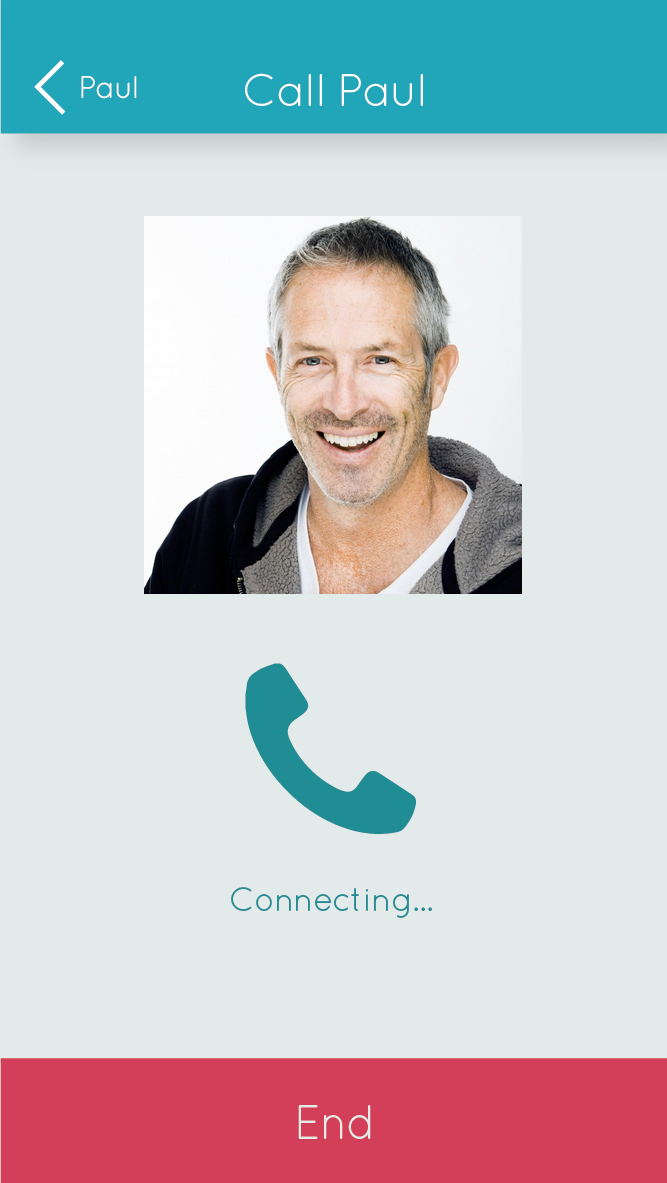
Paul is the Managing Director and heads up the sales team. Many people need to speak to Paul in the course of a normal working day, but he is as elusive as the Scarlet Pimpernel. He may be in one of the meeting rooms, tapping away on his laptop, or he may be in London at a sales pitch – he never, ever updates his calendar and often decides to go to meet clients when he gets up that morning. No one ever knows where he is or what he's doing.
Your mission, should you choose to accept it, is to conceive of an iPhone application that will solve the 'Where's Paul' problem for Widget Consulting. All of the consultants and Sales people have a company phone, which is an iPhone 6, so one application on one platform can solve the problem, if you design the right application."
User Interviews
We were presented with the problem, and interviews from two different prospective users of the system. The problem was loosely defined in the brief, so part of the challenge was to interpret the user interviews in order to define the exact pain points in the current system.
Interview with Kate, the receptionist
"It's really frustrating, trying to find where everyone is each day. It's like they wake up and roll some dice to decide how and where they will spend their working day. I know they are busy, and things change fast for them, but it wouldn't kill them to send me a text to say if their plans change and what they're up to. The rules are dead simple: if you're working from home, you need to arrange that with your project manager in advance, though some decide they are working from home on the day. If you're going on holiday you need to give a couple of weeks notice to your PM, and if you're sick, you or someone else needs to notify us before 10.00 am. If I don't hear from people l have to ring them, and if I can't get an answer I have to go to their personnel file and start calling their family contact numbers, which causes a lot of worry to whomever I call. There has to be a simpler way to manage this."
Interview with Peter, the consultant
"I hear what Kate's saying, but letting reception know where I am is usually the least of my worries. If I have a deadline and go to the office, l'll likely be bombarded with calls and questions from colleagues and won't get my work done, so I often decide to work from home at short notice. I know I should arrange it with my PM, but she's more worried about me meeting the deadline than about HR rules. This behaviour does cause a problem, though. If I need to chat to one of the sales team, or another colleague, l have no way of knowing where they are if they aren't at their desk, which is usually the case. Reception send a mail around every morning, but I don't read it, it's usually too vague and not updated during the day. I end up asking colleagues "Where's Paul" or whoever it is I am looking for, then try phoning or texting them. It'd be good to have some kind of status board, and be able to ping people to get them to contact me, or say they can't if that's the case."
User Stories
From the interviews given to us, we came up with a user story for each user, in the form of a one-line statement, ‘As a … I need… so that…’. This is helpful in clarifying exactly who each potential user is, and what their aims are in using the app, and what needs they have that have to be catered for. The following are the three user statements we drew up based on the interviews:
As a Receptionist, I need information about the whereabouts of every employee, so that I can keep records of who is currently in the building for Health and Safety reasons.
As a Consultant, I need a quick and easy way to remember to inform my colleagues of my location, so that they don’t get frustrated with me.
As a Employee, I need a way to see where my colleagues are, so that I can get in touch with them easily if I need to.
Problems, Insights and Solutions
From the user interviews, we came up with three main insights into the issues at the core of the system. The UX challenge is to design a solutions which will eliminate, or at least minimise each of these problems, and work together as a coherent and efficient whole.
Problem 1
Some employees travel a lot during the business day, to meet clients. Their colleagues often don’t know where they are, or whether they are available to contact if they are needed.
Insight: Employees are interested in knowing where their colleagues are throughout the day, and they need a clear way of seeing instantly whether they can be contacted or not.
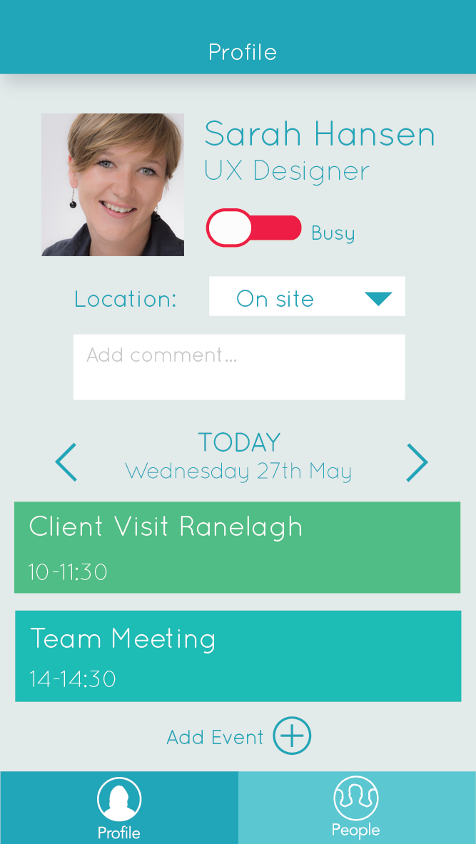
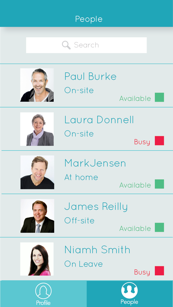
Solution: A list of all employees and their current locations. When the employees open the app at 9:30, they are asked to select whether they are working from home, en route, off on leave, or at a client meeting. This information is then displayed beside their their name in the People list, so that it is accessible to all other colleagues using the app.
Problem 2
Employees tend to forget to inform people where they are on a regular basis.
Insight: Employees might need some sort of notification or reminder to update their location.
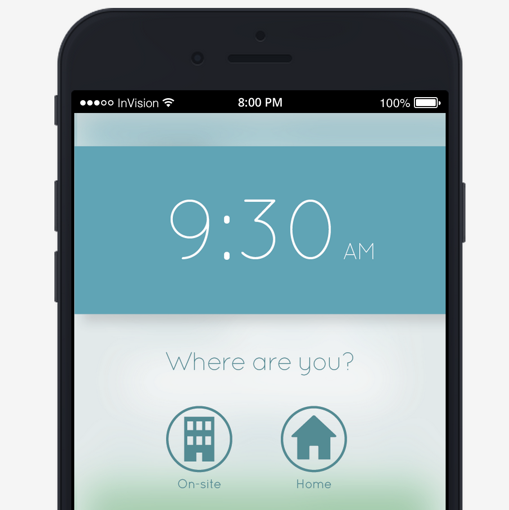
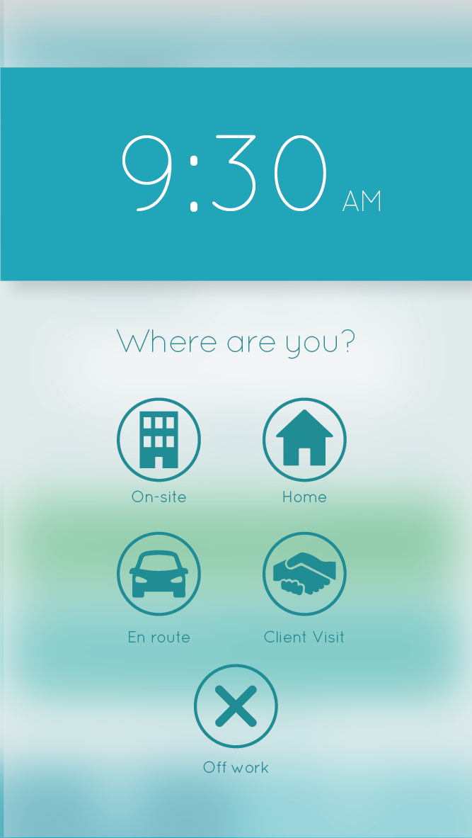
Solution: ‘Where are You?’ reminder If the user hasn’t entered the building by half nine, or if they leave the building during office hours, a notification screen will pop up, even if they haven’t opened the app. It will ask them a question - ‘Where Are You?’, and they will be presented with a five icons to choose from - ‘On-site’, ’At home’, ‘En route’, ‘Client Visit’, or ‘On Leave’. Presenting a choice in the form of icons makes it as easy as possible for the user to input.
Problem 3
Employees don’t want to spend extra time and energy informing collegues of their whereabouts on a constant basis.
Insight: Updating their location should be as unobtrusive and painless as possible for the user. If there are existing systems in place, it should fit in with them seamlessly so as not to cause any disruption to employees’ existing habits. Wherever possible, if something can be done automatically, without needing to involve the user, it should be automatic.
Solution: Automatic synchronising. Ideally the user of the app will never be required to fill out their location manually. Many employees already use google calendar to log their schedules for the day, and record their holiday days. The app should be designed to sync with the existing calendar on the phone, so if they have already input their events and location, the app will update to reflect this, and the “Where are you?” alert won’t appear.
The app should also detect when the user has connected to the WiFi at the office, and update their location automatically. If any automatic update is made, the ‘Where are you?’ alert doesn’t appear to the user.
Problem 4
Different people might need different levels of information about locations of their colleagues.
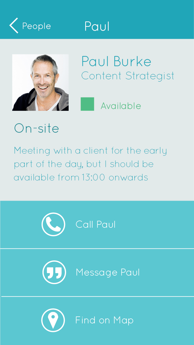
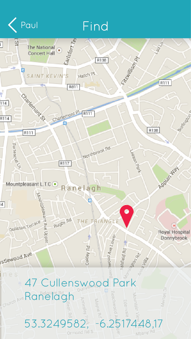
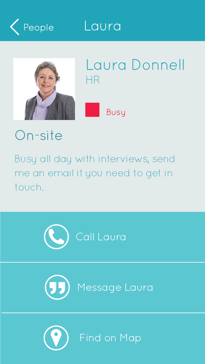
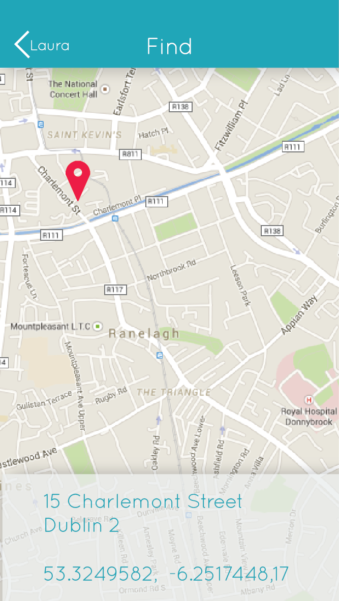
Insight: Other employees should be provided with the least amount of information neccessary to do their job. The least amount of information they might need to know is whether their colleague is available to contact or not, whereas the most information possible would be their actual real-time location on a map.
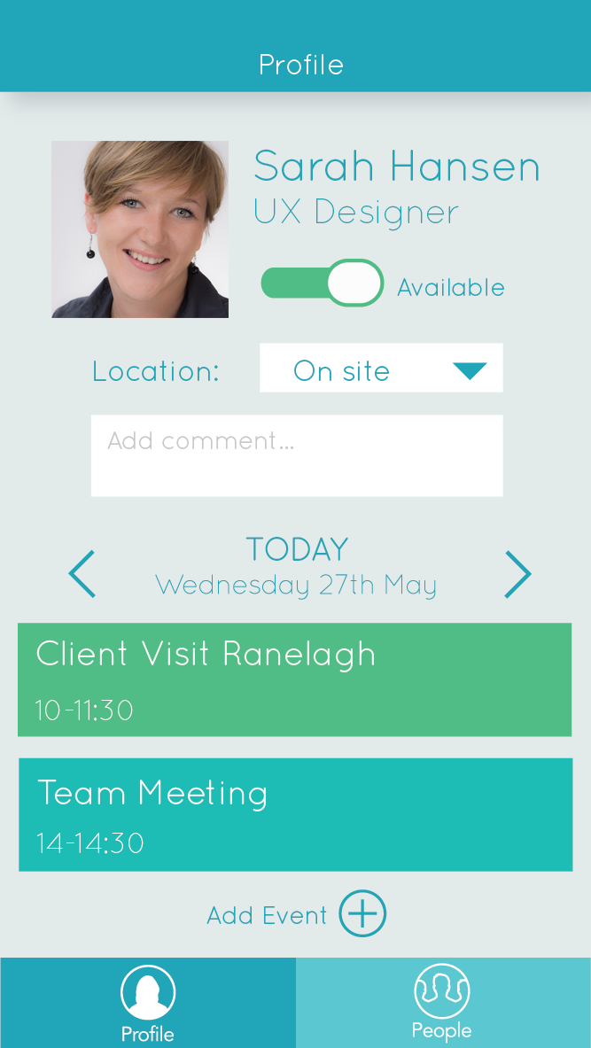
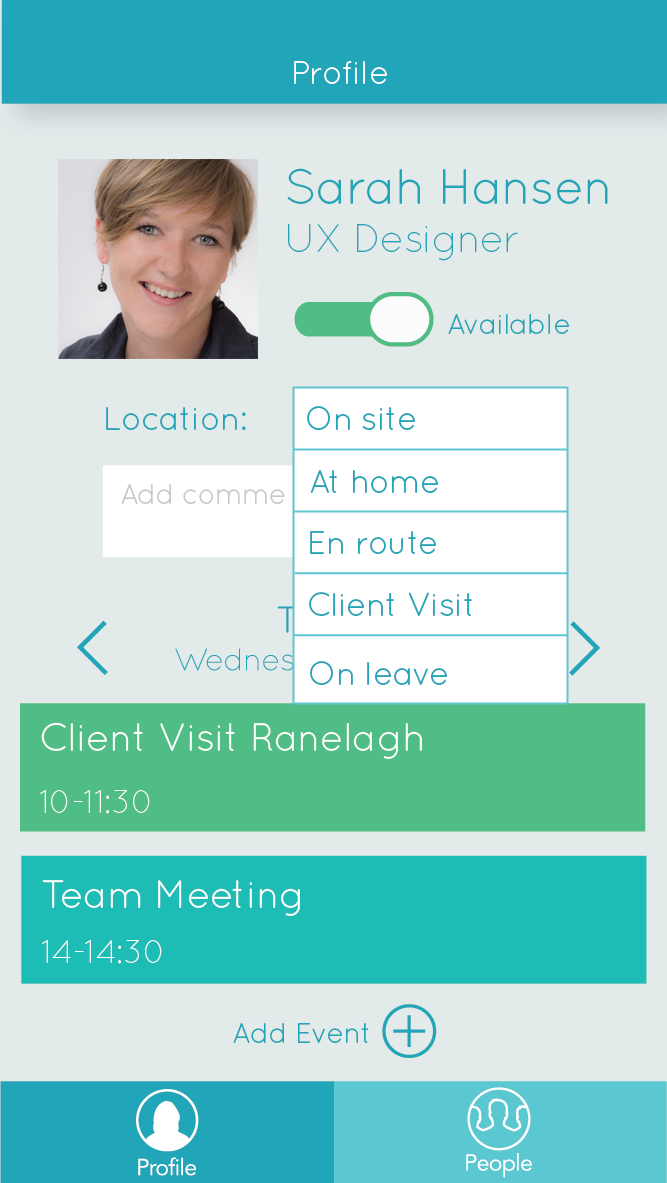
Solution: Different levels of information available. There is a toggle switch on the Profile page of the app where the user can select whether they are available to contact or not. This way other colleagues can see quickly by colour (red or green), whether they can be contacted. (By default, it would be set to unavailable if they were en route, at a client meeting, or on leave. The employee would have the option to change this on their profile if they wanted.)
The different levels of information are each accessible on different levels in the app, and take different levels of effort to access. Basic availability is clearly indicated by colour beside the person’s name, and in order to find actual location on a map, the user needs to navigate deeper into the app.
Initial Wire-frames
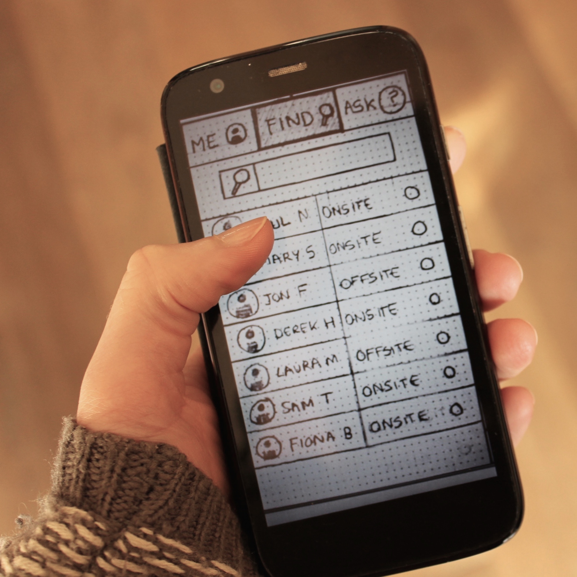
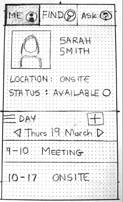
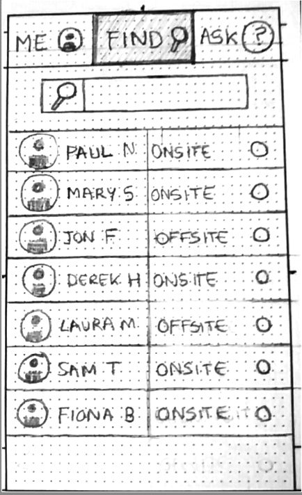
Taking into account the design solutions we had come up with, we now had to work out the flow of how the user would use the app, and what areas and screens they might need. We made some simple wireframes which outlined roughly three main areas of the app, which would be ‘Me’, ‘Find’, and ‘Ask’.
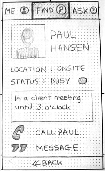
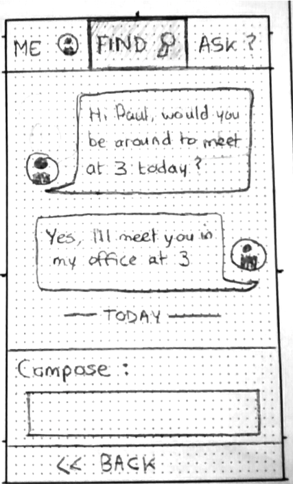
The first area, ‘Me’, would contain the user’s own profile. Here they could change their location or status, and view their own calendar. The ‘Find’ area contains a list of all the employees, and their locations. A search bar at the top would filter the names and allow for faster finding of specific people. The ‘Ask’ area would be where the employee could ask permission from a manager to work at home, for example.
 The original wireframe sketches for 'Where's Paul?'
Initial Prototype
Once we had made the initial paper wireframes, we used POP, a lightweight prototyping tool, to photograph the wireframes and make them into a simple interactive prototype that could be viewed on a phone.
User Testing
At this point, the focus of the project switched from a team-based project to an individual one. We each had to take the work we had done as a team, refine the solution further, and create a full high-fidelity prototype of our proposed design. My first point of action was to test the existing POP prototype with users. I asked them to do a few simple tasks, such as find out where Paul is, and to ask their boss for permission to work from home.
 User testing on initial prototype
The findings of the user-testing indicated that users were confused as to why they would need a separate area for asking for permission from a manager. Their immediate instinct in every case was to find the managers name on the list, go into their profile, and message them from there.
Based on this, I made several changes to original app flow. I cut out the ‘Ask’ area of the app, and reduced it to two areas. These I renamed to ‘Profile’ and ‘People’, for the sake of clarity. Now if you wanted to contact your manager, you would do so by accessing their profile, and sending a message from there.
App Flow and User Journey
Once I had refined the flow of the app, I drew up a diagram to illustrate all the potential journeys the user might take through the app, and the screens they might need to encounter.
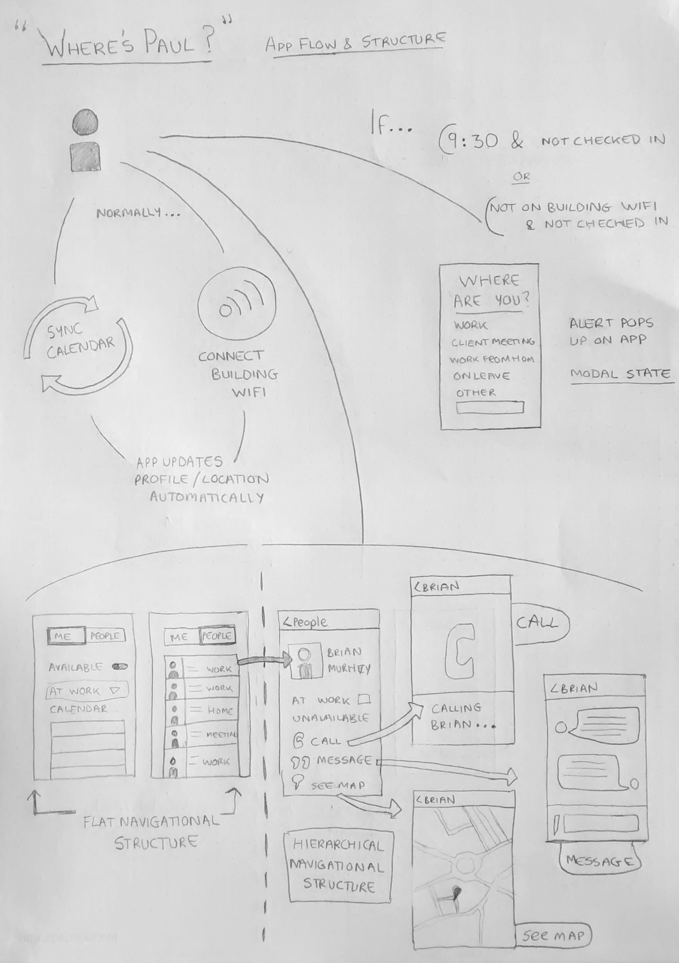 Diagram of User Journey through 'Where's Paul?' App
Designing for iOS
Before I set about designing high-fidelity mock-ups of the final app, I read carefully the iOS Human Interface Guidelines, and kept in mind its themes of deference, clarity and depth.
Functionality motivated the design of this app. It was important that the UI didn’t compete with the content. I used flat, clean design and a limited and consistent colour palette, with no unnecessary decorative elements. Icons are clear and consistent in style, and labelled for ease of understanding. I have made use of negative space where possible to avoid cluttering the screen, and all tappable areas are at least 44 pixels in size.
I have tried to create an illusion of depth and visual layering by using a translucent background on the “Where are you?” screen. The feeling of fluidity would be greater enhanced by more sleek transitions between screens, but I was limited to the transitions available on InVision in this prototype.
I designed the structure of the app around the iOS navigational methods. The “Profile” page and the “People” page are flat in structure, and can be toggled between via the tab bar at the bottom of the screen. From the “People” page, individual pages can be accessed via a hierarchical structure, with a navigation bar at the top of the screen, to let the user know where they are within the app. The nav bar also holds a back icon, so that the user can navigate back out of the page.
I also changed around the locations of the navigation bar and tab bar, to better reflect the iOS Human interface guidelines. The App Flow and Structure diagram at the beginning of this document is the revised version of the App flow.
I have only used the modal context once within the app, this is the “Where are you?” page, and will only appear if the user has not already supplied their location. I used the modal context to narrowly focus the task, and the user must choose one of the icons before they can interact with the app again.
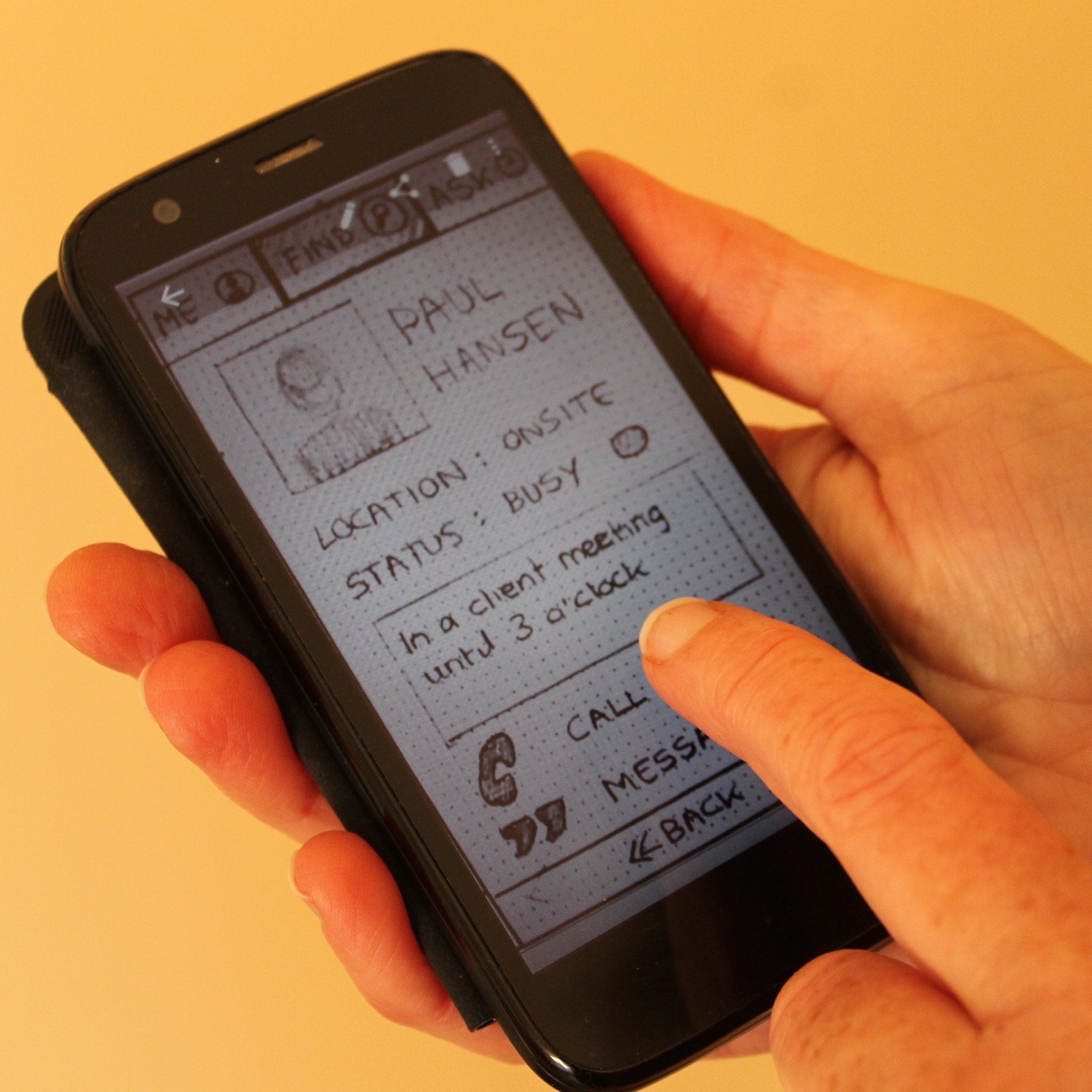
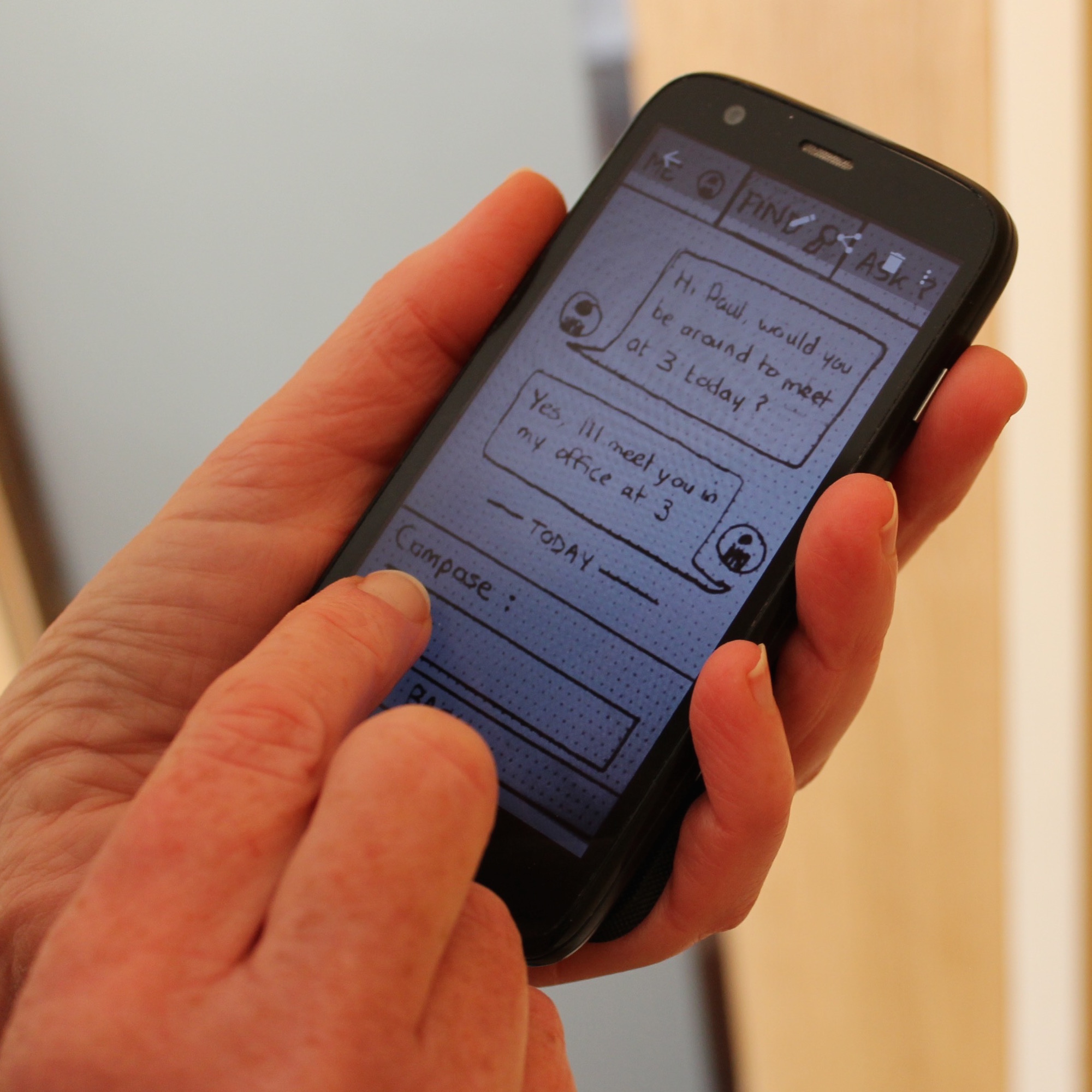
High-fidelity Mock-ups

Interactive Prototype
Here's the final interactive prototype I made with InVision. Go ahead and try it out!